Feature Visualizations
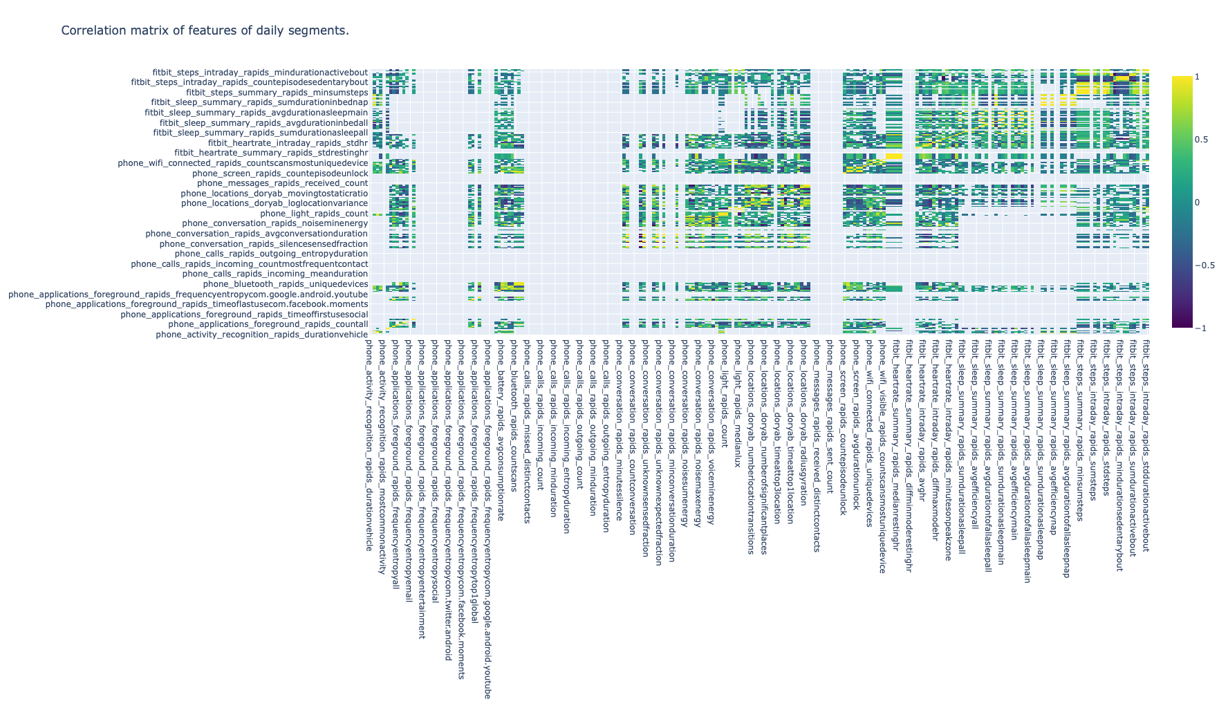
1. Heatmap Correlation Matrix
Columns and rows are the behavioral features computed in RAPIDS, cells’ color represents the correlation coefficient between all days of data for every pair of features of all participants.
The user can specify a minimum number of observations (time segment instances) required to compute the correlation between two features using the MIN_ROWS_RATIO parameter (0.5 by default) and the correlation method (Pearson, Spearman or Kendall) with the CORR_METHOD parameter. In addition, this plot can be configured to only display correlation coefficients above a threshold using the CORR_THRESHOLD parameter (0.1 by default).
Example
Click here to see an example of these interactive visualizations in HTML format